Jun 24, 2024
The design language of notely
Jun 24, 2024
The design language of notely
Jun 24, 2024
The design language of notely
The design language of notely, where do i (warre) start?
Well, it's simple. Litteraly, it's simple design that always catches your eyes.
Let's see the design in action below here to get deeper into the creation of a cohesive UI.

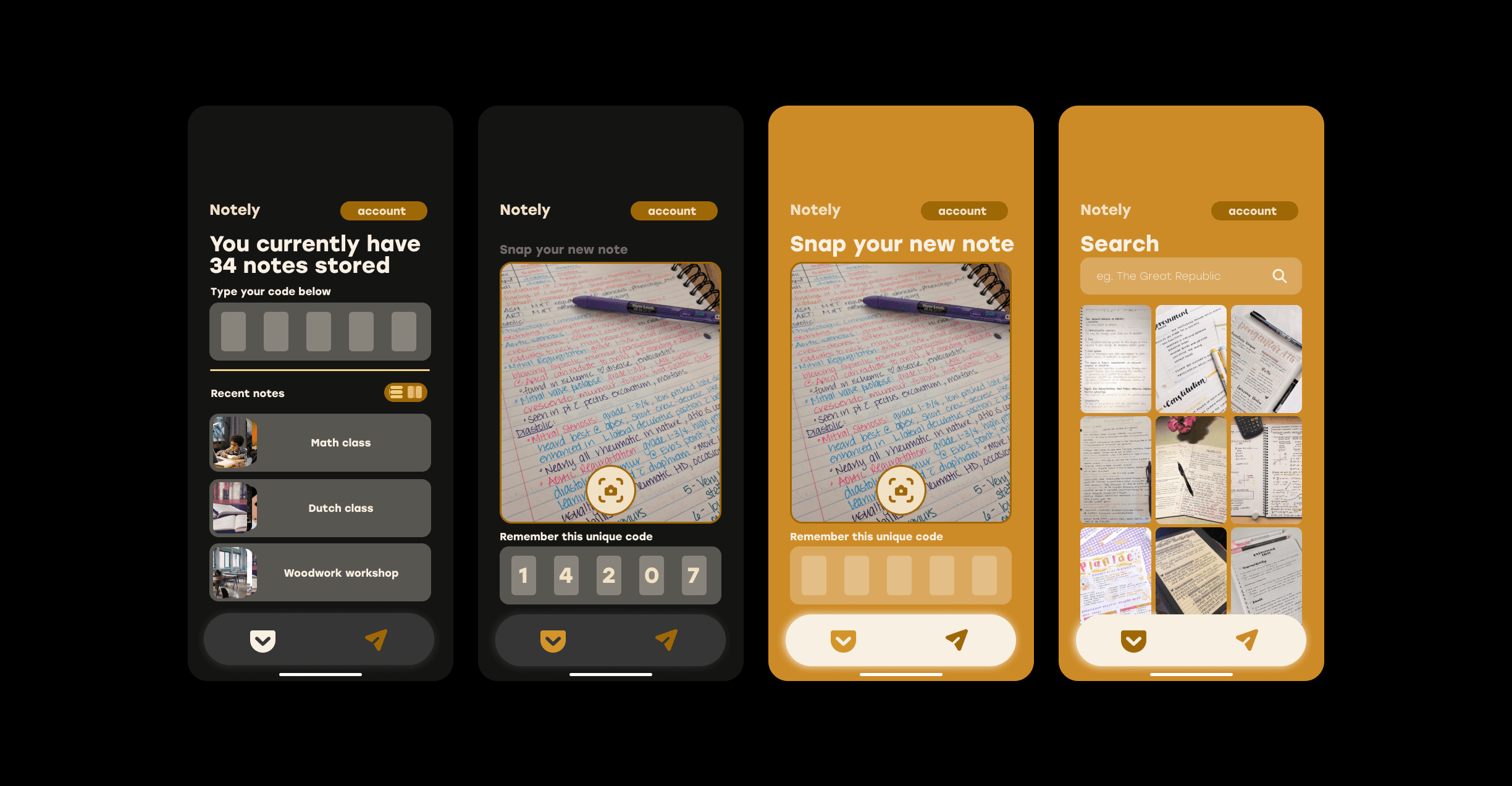
It all starts with the colors,
These are all based upon each other, like you can see above here.
They also complement each other quite nicely. Which is neccesary to create a sort of peace in a still pretty jam-packed page.
The subtle accents and images are also all thought to resemble a simple design.
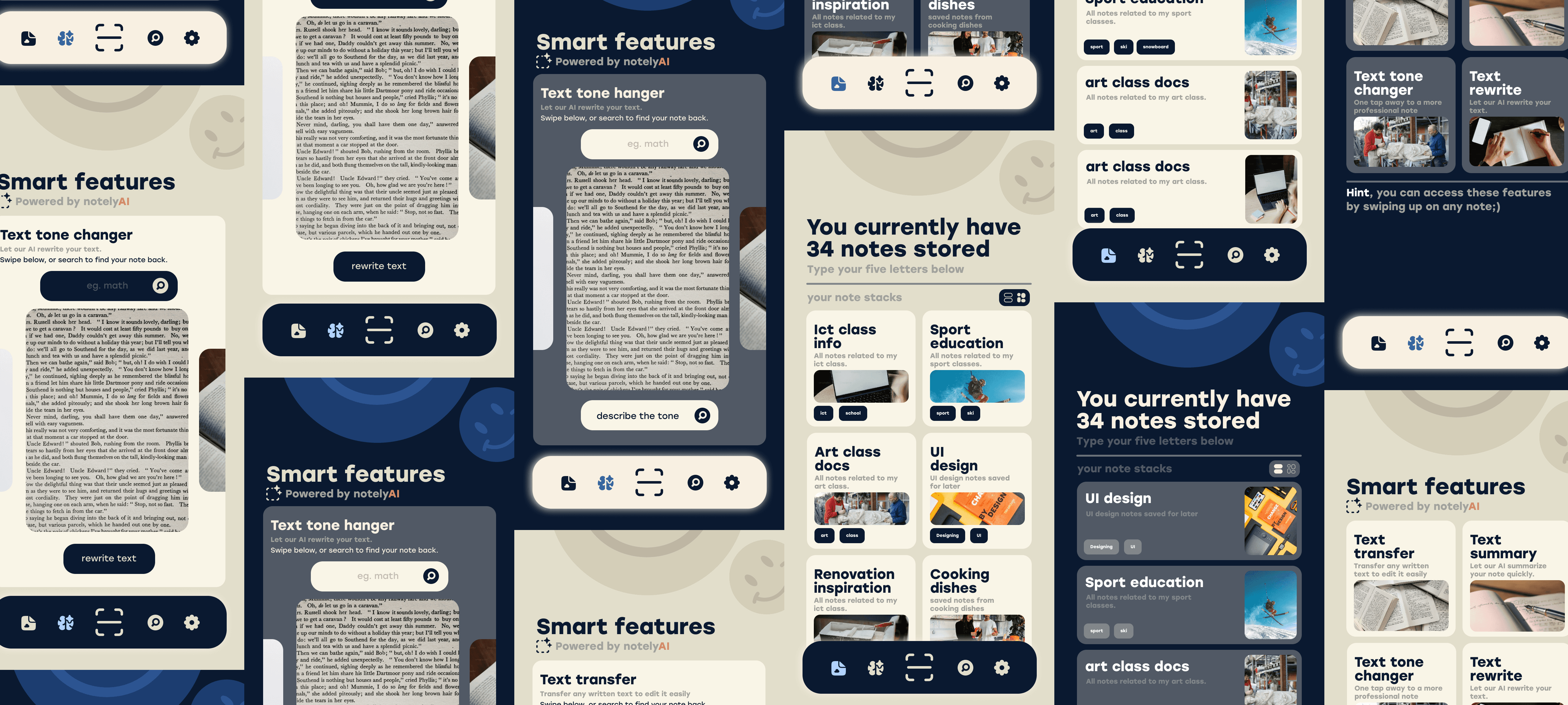
The features,
The idea is to make the feature pages all a bit the same, no major changes that get blasted in your eyes each time your swipe, as seen above here.
Do you like this UI/UX, let me know on instagram @warre.creates or @notely.app;) Thanks for checking our website blog out!
Sign up for our waitlist
Want to be the first to get our app, sign up below;)


The design language of notely, where do i (warre) start?
Well, it's simple. Litteraly, it's simple design that always catches your eyes.
Let's see the design in action below here to get deeper into the creation of a cohesive UI.
It all starts with the colors,
These are all based upon each other, like you can see above here.
They also complement each other quite nicely. Which is neccesary to create a sort of peace in a still pretty jam-packed page.
The subtle accents and images are also all thought to resemble a simple design.
The features,
The idea is to make the feature pages all a bit the same, no major changes that get blasted in your eyes each time your swipe, as seen above here.
Do you like this UI/UX, let me know on instagram @warre.creates or @notely.app;) Thanks for checking our website blog out!
Sign up for our waitlist
Want to be the first to get our app, sign up below;)
Our latest stories:

Saving notes was never easier;)
Experience the weather
like never before.
Saving notes was never easier;)